Viewing entries in
user experience

Project Management: Physical vs. Digital

1 Comment

Project Management: Physical vs. Digital

I recently worked with tech company to build out a new online trading platform. The company set a tight product deadline and we were hustling to manage our personal deadlines as well as department deadlines. In my past experience experience with project managers, most default to one of a variety of online software tools to manage projects and associated tasks (think Basecamp, JIRA, Trello, etc.). But without a "project manager" here, I still wanted a transparent way to view where the UX & design team were in our project completion–what items were not yet started, in progress, or completed.

My UX team decided to adopt an empty whiteboard to post our team's tasks on–using different colored post-it notes to denote different types of tasks. All team members were responsible for managing their own tasks and moving them to the correct category when they started or completed them. It was a great visual indicator for everyone involved to see the progress we were making without having to open another tab in our browser or log it in another new software management system.

Soon after we began our task board, engineering decided to adapt the whiteboard to include their team's tasks as well. Everyone found something very satisfying about using a lo-fidelity, tactile method of writing down items and moving them across the board.

While I LOVE my digital cloud applications, collaboration doesn't always have to happen in a digital format. And, in this case, it was a refreshing experiment that took us back to an age before computer-based project management. We were constantly reminded, by this huge physical board, of our end goal. And we made it.

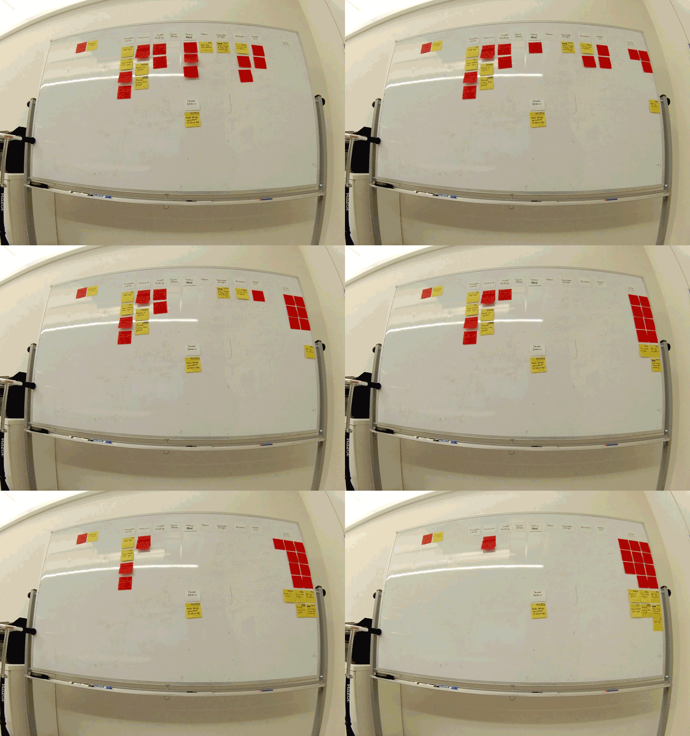
The progress of our task management board. We even included a "key" so non-participants had full transparency into our process and progress.

The progress of our task management board. We even included a "key" so non-participants had full transparency into our process and progress.
1 Comment

Working Together, Half a World Apart

Comment

Working Together, Half a World Apart

The past 2.5 months working out of New York City with a team based in Singapore has felt like a test for me. A test to see how early I can wake up, on a daily basis, and be coherent enough to start a scrum meeting. At this point, I'm pretty confident I'm running a passing grade on that test–but dang, 6am is legit early for this New Yorker.

But this project has also brought on challenges working with a UX team that not only resides on a different continent, many many time zones away, but working with a client that resides in a completely different location than us both.

Here are two challenges we've worked through and some of my personal takeaways:


UX Challenge 1:
How could our UX team best collaborate on creating a best in class product experience given our opposite time zones.

Our approach:
My UX colleague in Singapore and I started by setting up a daily schedule were we would adjusted our working hours in a way where we could overlap 2-3 hours of our day. While this obviously created working hours there were a bit uncharacteristic for our profession (me 6am-3pm, and my colleague 12pm-8pm), it was practical given our situation. Most days we spent our overlap hours on Skype calls and video sketching sessions, white boarding, and post-it-noting. We worked through complex user flows, content categorization, and user stories live on a Google-drive document. Each of us would populate our ideas while discussing our rationale, and then we'd move items around. In many ways it was almost like working together in person, at the same table, except most days I worked in my pajamas.

Down & dirty UX sketch video session

Down & dirty UX sketch video session

My Takeaways:

  1. Many hours apart, technology was the key that helped us bridge a communication gap, and aided in the facilitation of a more collaborative working environment that seemingly only 20 years ago may never have been possible (or just way to expensive to even consider). Regardless of whether we were in the same city or half a world away, real-time tools (Skype, GoogleDrive, etc.) helped us quickly convey thoughts without having to save a 25mb file and send it via email, only for it to get stuck in an outbox. GoogleDrive has since become my tool of choice for a lot of UX-related tasks–planning/estimating, aggregating research, writing findings reports, building sitemaps, and even storing folders worth of sketches–basically anything that I need to access wherever/whenever with whoever. This cloud thing is doing wonders for my ux work.
     
  2. I never considered the obscene number of distractions a regular office environment could produce–coffee breaks, meetings, puppy play time, meetings, client pop-ins, meetings, birthday events, meetings, lunch and learns, and obviously MORE MEETINGS. Having working hours where the majority of the team was sleeping made my day, for the most part, 100% uninterrupted work time. I found I could complete tasks faster and more efficiently with less interruptions. And, this also made my daily morning scrums and team calls that much more focused. Win/Win. 


UX Challenge 2:
How does our UX team most efficiently convey our complex design concepts to a client we would not have to opportunity to see or work with in person.

Our approach:
After working with the same client last year, we knew it would be key to sell our well-thought out experience vision to the client. With 8 sprints set up to manage the various areas of the product, we utilized each of those sprints to set up a focused presentation with the client. Much of our work had been done behind the scenes–researching, thinking, validating–and we struggled a bit to find a way to condense 3-4 weeks worth of information into a single 1 hour presentation. We decided on a hybrid presentation approach. We would first set the stage with a few slides that brought the client up speed on our progress (in the grand scheme of the project), what we were presenting in the review (to get their blessings on), and the next steps for everyone involved. Outside of that, my colleague and I utilized many of the sketches we created in our sessions and stitched them together using the prototyping software, Axure. We wanted to use this as our presentation tool, to walk the client through our visualized structure and as well as use it to key in on why we proposed specific experiences.

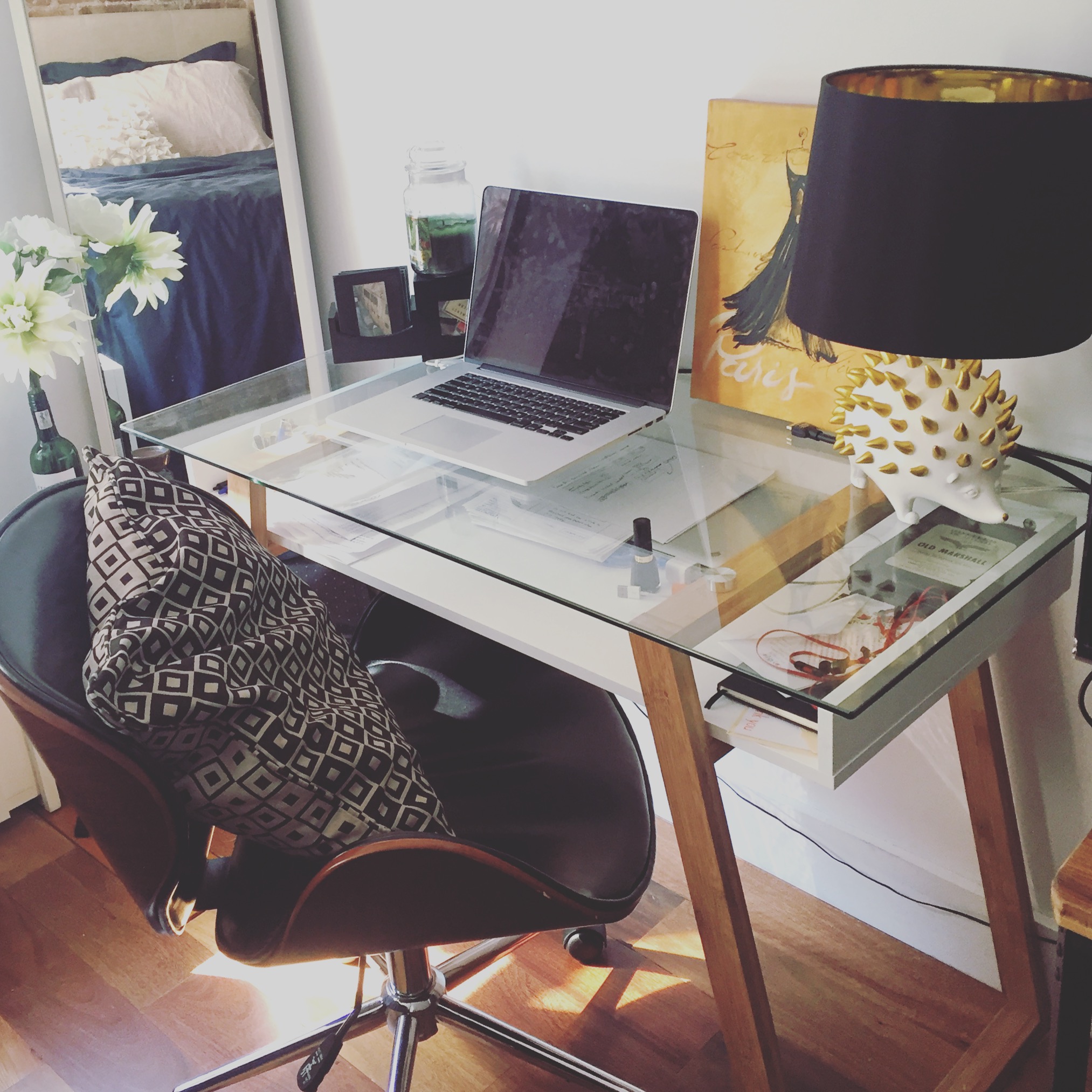
My home office before a client video presentation–design zen.

My home office before a client video presentation–design zen.

My Takeaways:

  1. Don't be afraid to fail or do it wrong the first time. Our first attempt at presenting our UX via interactive sketches turned out to be a bit difficult for engineers and our very technical audience to comprehend. But, that was, in theory, great. We learned something about our audience! They wanted something more tangible. They wanted to see real content they already had populated in our work. This learning would guide our next presentation. 
     
  2. Sometimes what you think may be the most efficient way of working turns out to be less efficient than imagined. Sketching is fast–down and dirty and not really super focused in on the details, but rather the core concept. That's great for communicating quickly, but having to scan sketches in, resize them, link them up in a prototype all to learn that you forgot a key item in the experience can really slow you down. We were on a limited time frame and to make small text edits and rearrange items in sketches became much more difficult than it would have been had we simply built our concepts out in Axure to begin with. 


And those takeaways are why I love what I do. No two projects are the same. No two clients, teams, offices, or tools are the same. It's really an act of progressive learning. We take our best stab given our past knowledge, current situation, and team structures with the understanding that we will have to be agile–always learning and adjusting appropriately. So, cheers to new experiences, whether in the same city, or half a world away.

Comment

The Emergence of CUI (Conversational User Interfaces)

Comment

The Emergence of CUI (Conversational User Interfaces)

The "Age of the App" has been in full effect for the past 7 years. When mobile apps first started popping up in 2008, no one could have expected them to take over over the technology scene and completely revolutionize how we live and work. 

Currently, the iTunes app store houses around 1.4 million apps and the Google Play Store 1.7 million. (And yes, don’t forget the few hundred thousand on the Windows Phone Store, Amazon Appstore, and the struggling BlackBerry World). These numbers have had constant steady growth over the past 7 years. But how long can this continue?

In a recent Nielsen study, the average smartphone user accesses about 26.7 apps on a monthly basis. And, this number hasn't fluctuated much in the last 2 years. So, what does this mean? Why are businesses continuously developing new mobile apps if user habits aren’t shifting towards a higher use of apps?
 

GoButler SMS functionality

GoButler SMS functionality


This week I attended a Tech in Motion meet up in New York City. And, even there it was clear, there is still a large market push for apps. Every business is looking for the elusive unicorn UX designer and full stack developer to build out their visions. But when I ran into Tim Sturge, head of engineering at GoButler, I was intrigued by their consumer platform model. Their business focuses on providing anyone with a smartphone access to anything on-demand. Need flight reservations? Food delivered? Dog walked? Shoot them an SMS text and they’ll arrange all the details for you. No app needed. They’ve essentially done two key things differently:

  1. Removed the barrier to entry by simply avoiding an app shell all together. 
  2. Created a conversational user interface (CUI)—an interface which users are already familiar with. There's no need to learn a new app interaction language/pattern as the service focuses on SMS as their main channel for interaction. 

And GoButler is not the only company that has started taking this contrasting approach to building an app. Magic is a similar SMS-based ordering service that gives user 24/7 access to on-demand services and MTA Bus Time is changing the way commuters get information about their bus arrival times by allowing them to text the MTA with their bus code or intersection to receive an immediate message with how many stops away their bus is.

Rhombus 

Rhombus 

Rhombus brands itself as "the first conversational commerce platform," that helps businesses get paid by customers within an SMS conversation. Rhombus credits their deliberate no-app choice to the fact that using a CUI allows their technology to disappear in the background, therefore reducing checkout abandonment. 

While there is a growing number of companies taking this novel approach, tailored app experiences can certainly provide unique value to users via richer, more engaging experiences. In these cases, a simple SMS may never be able to replace it. However, there is also value in businesses utilizing a conversational user interface approach—ease of use, familiarity, versatility, human-centered nature, conversational context. To add to this, the 80/20 rule—80% of app users will only ever use 20% of the app's functionality—provides a solid reason to consider text-based interactions over a bulky app design.

Considering a text-based conversational user interface is a creative solution in which no full-fledged app is needed to conduct key interactions. So, if you're in the market to build an app, don't leave the "text space" out of your creative toolbox. 


Comment

How to sell products people don't need

Comment

How to sell products people don't need

Q: How does a store in a sweltering hot city make money selling gloves?

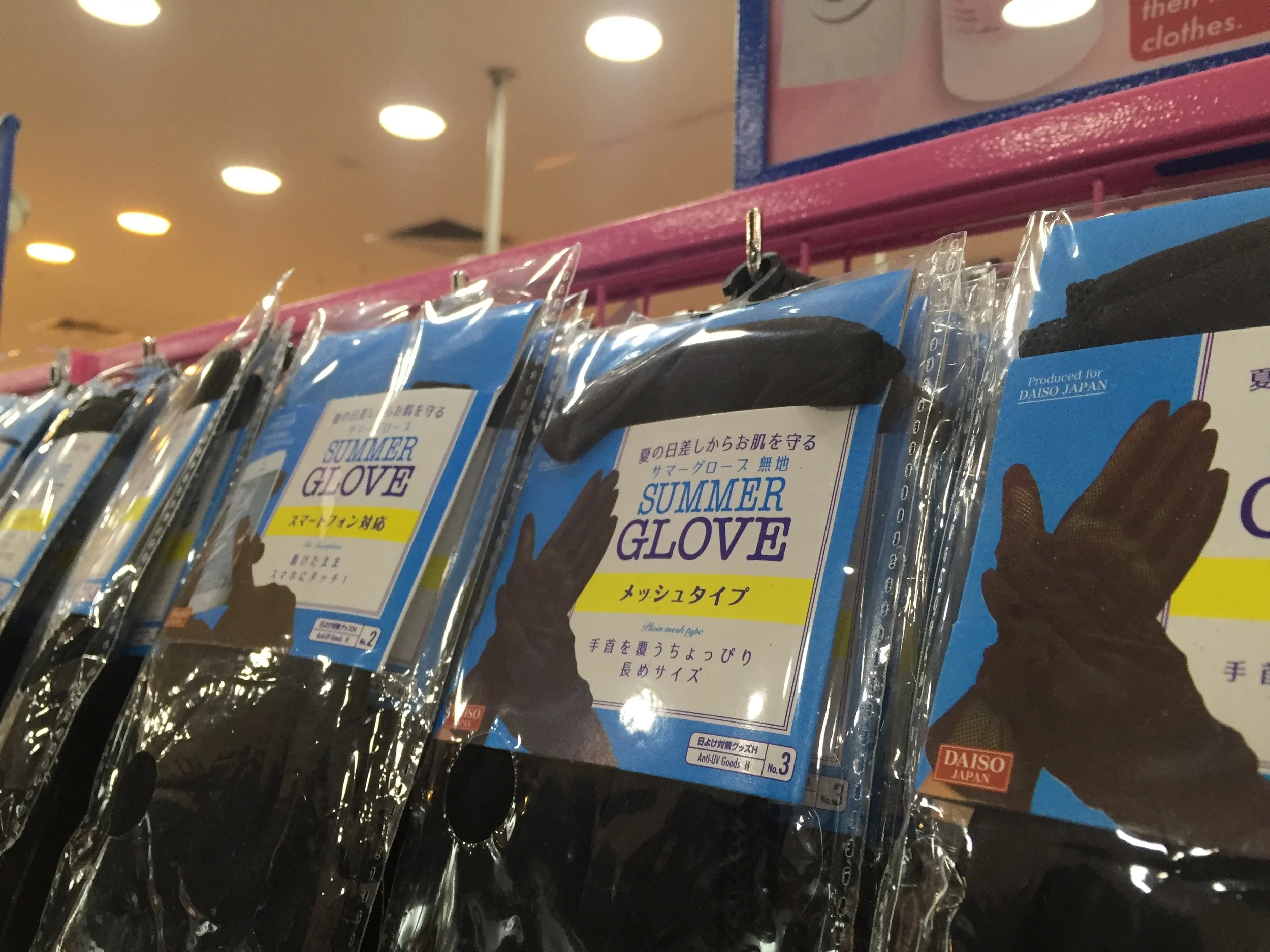
On my recent travels to Singapore I stumbled upon racks and racks of gloves and scarves in a city that only on the most rarest of occasions falls below 70°F. I was shocked. How do they do it? How does a store in such sweltering hot city make money selling gloves?

Well, the answer was on the packaging. No longer were they called "gloves"...because who here needs "gloves". What they do need is "summer gloves". SUMMER GLOVES. Add the word "SUMMER" and they're suddenly flying off shelves in balmy 90°F Singapore. Blows. My. Mind. 

Someone give that copywriter a raise.

Comment

Doing research in a 100 square foot office

Comment

Doing research in a 100 square foot office

When my 300 square foot New York City home is my UX office for 50% of the year, 100 square feet get dedicated to ideas, analysis, crazy drawings, and a splattering of post-it notes–right next to the bar.

The past few months I've been working with a talented team in Singapore doing extensive stakeholder and customer research, user profiles, and customer journeys for an enterprise US company. Communicating and sharing our ideas across many times zones isn't always easy when your process is very hands-on, but we've fallen into a continuous process of daily hangouts, Skype video conferences, long emails, and hand-offs. Because we are exactly 12 hours difference, someone is always touching the work. It's been a living, breathing, changing project, and I'm looking forward to spending the next month on the final vision proposal.  

Comment

If you're a host, you're an experience designer

1 Comment

If you're a host, you're an experience designer

I love hosting. Hosting weekend guests. Hosting dinner parties. Hosting wine and cheese nights. But being a host for gatherings has less to do with an enjoyable time for yourself and everything to do with creating an exceptional and memorable experience for your guests.

Recently I was invited to a wonderful couple’s house warming party. (And if these two invite you, you know you’re in for a treat.) I opened the invitation which described an evening of food, fun, and of course a little Fireball to get the party started. I was happy to find a very detailed description of how to use public transportation to travel to their home. While this may sound trivial, they knew their audience–many like myself commuting from New York City to New Jersey, a place many New Yorkers rarely venture to. So, for me, the party details couldn't have been more appreciated.

The day of the party I arrived at their duplex apartment, and on the front door found a small sticky note directing guests to the upstairs apartment. At that moment I realized without that note, I would’ve experienced a significant stumbling block in my journey. I would have pulled out my phone to look up a unit number or fumbled to write a quick text. But they recognized this potential pain point and clearly removed the barrier before I even hit it. 

Walking into their beautifully decorated space, we were greeted by hugs, laughter, a table overflowing with food, and a full bar that would put most New York City bars to shame. I had expected some chips and dip and maybe some wine, but clearly, this party was begging to be remembered. 

The hosts spent time giving each guest a personal house tour, making everyone feel like it was a party just for them. They continued to effortlessly facilitate the most graceful of conversations, making connections between our backgrounds, interests, and very unique personalities. 

But, the highlight of the evening got everyone out of their typical “I’m at a classy party” comfort zone. The hosts brought out a huge handful of temporary tattoos. This little moment of surprise turned into delight as it challenged what we thought a “typical” house warming party should be. Several Fireball shots later, a handful of guests ended up with My Little Pony tattoos on their faces. Dedication, delight, and all-around too much fun.

A week after the party I picked up my mail, and to my surprise I received a beautiful hand-written letter from the party’s hosts. They could have sent a friendly email or text, but in our current digital age, this small, very personal gesture brought me so much more happiness than any piece of digital communication ever could.

So, if you’re a host, you’re an experience designer. And, if you’re want to be a fabulous host, here are the 3 tips that I live by:

  1. Exercise empathy and recognize where your guests could have potential pain points to prevent them ahead of time. Put yourself in their shoes and truly think about where they could run into problems. They’ll be thankful you did.
     
  2. Exceed expectations. This doesn’t mean spend a lot of money, this means think differently about how to go above and beyond what guests are expecting to get our of your event or experience. 
     
  3. Create small unexpected moments that will delight. It may sound cliché, but these are the moments and the stories that will get shared over and over. 

Who knows…you may end up sharing some laughs over a stack of My Little Pony temporary tattoos. I did, and it will stick with me forever.

1 Comment